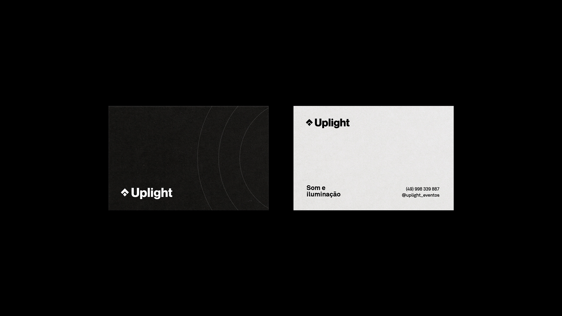
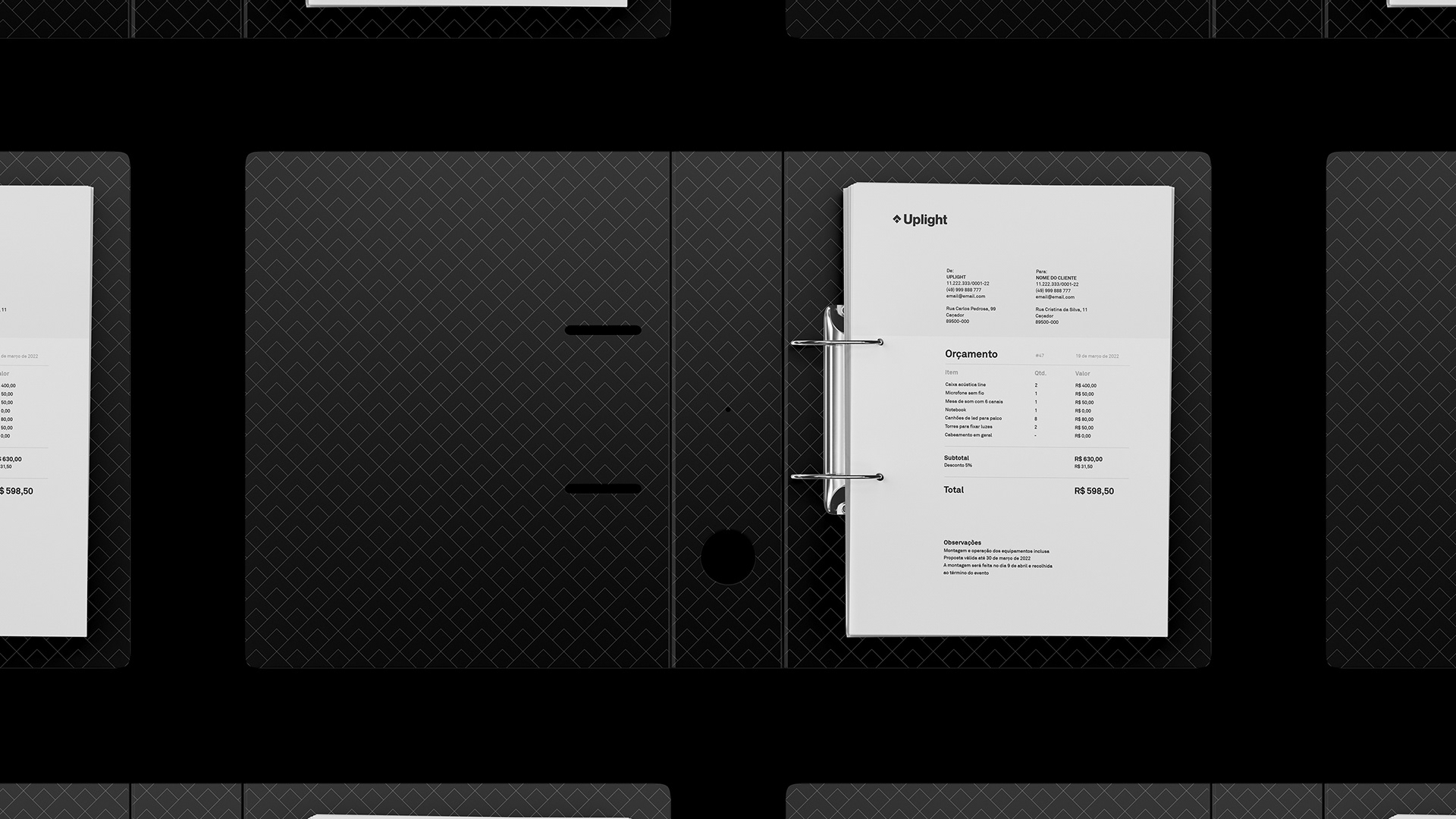
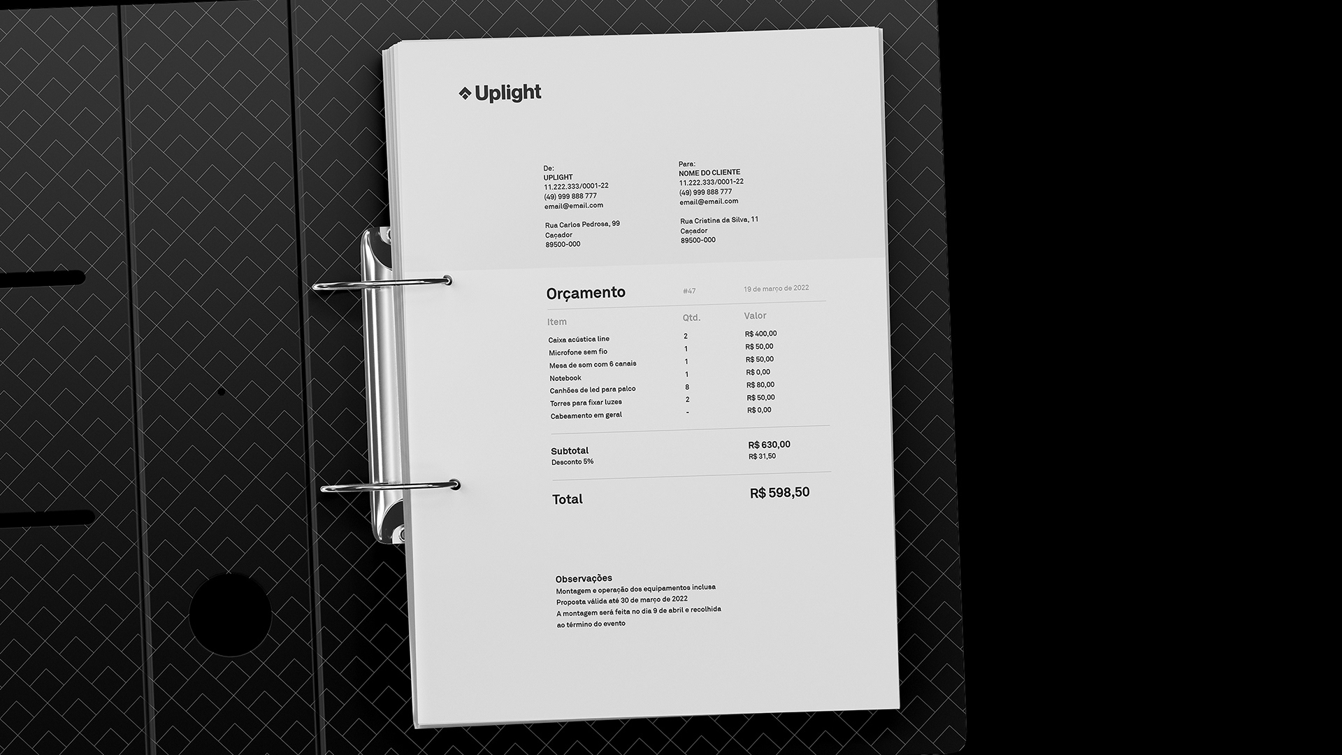
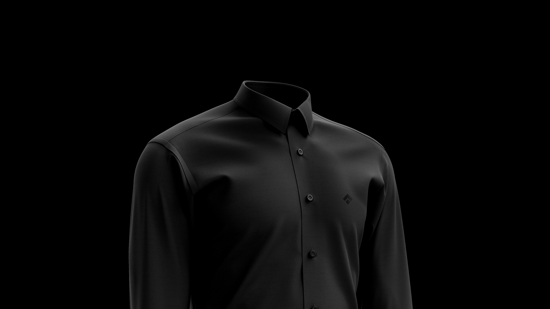
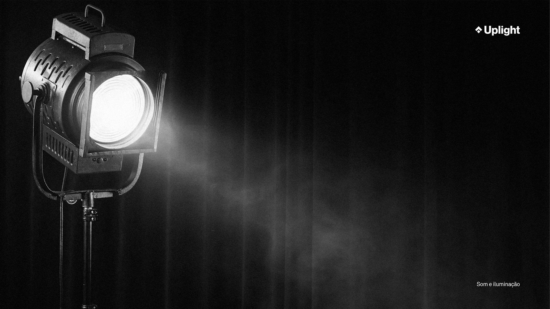
A Uplight é uma empresa de som e iluminação para eventos, com 3 públicos distintos, mas que possuem em comum a preferência por uma marca sóbria, séria e segura.
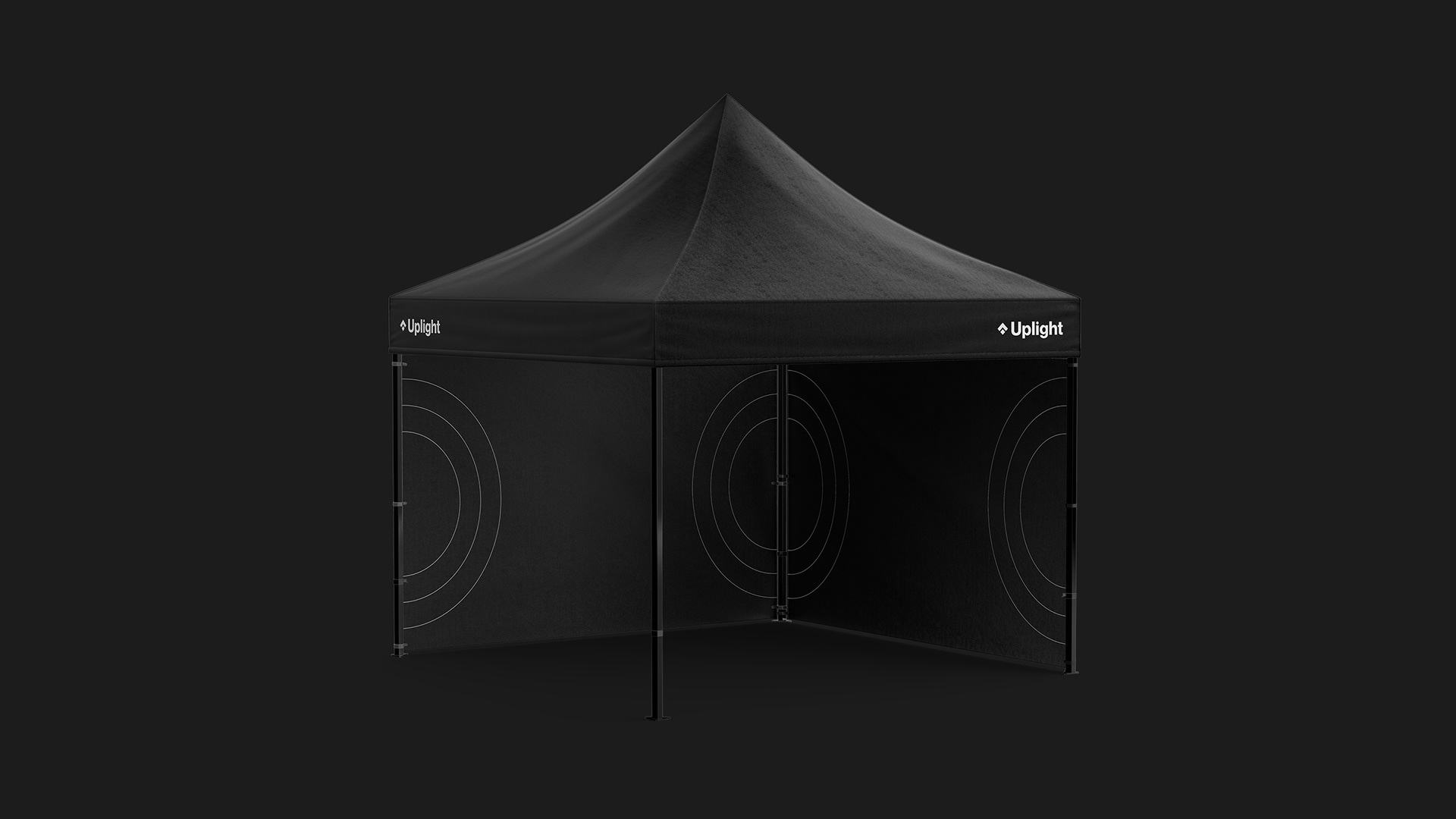
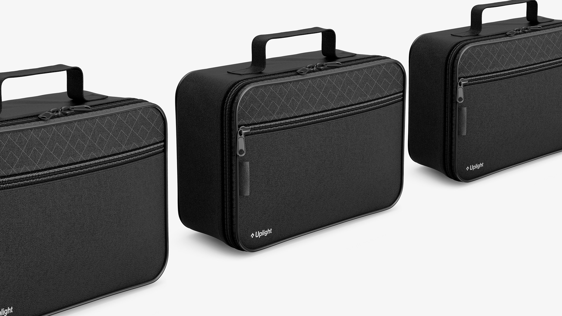
Por conta disso, trouxemos o minimalismo como elemento principal, que além de corroborar com o que a empresa quer transmitir, também é uma vantagem competitiva, visto que os concorrentes não utilizam em suas marcas e é uma cor padrão para uniformes e afins.
Atingindo assim todos os requisitos identificados inicialmente: uma marca discreta, sóbria, que transmite segurança e confiança para o cliente.
-
Uplight is a sound and lighting company for events, with 3 different audiences, but who have in common the preference for a sober, serious and trusted brand.
Because of this, we brought minimalism as the main element, which, in addition to corroborating what the company wants to convey, is also a competitive advantage, since competitors do not use it in their brands and it is a standard color for uniforms.
Thus achieving all the requirements identified initially: a discreet, sober brand that conveys security and confidence to the customer.
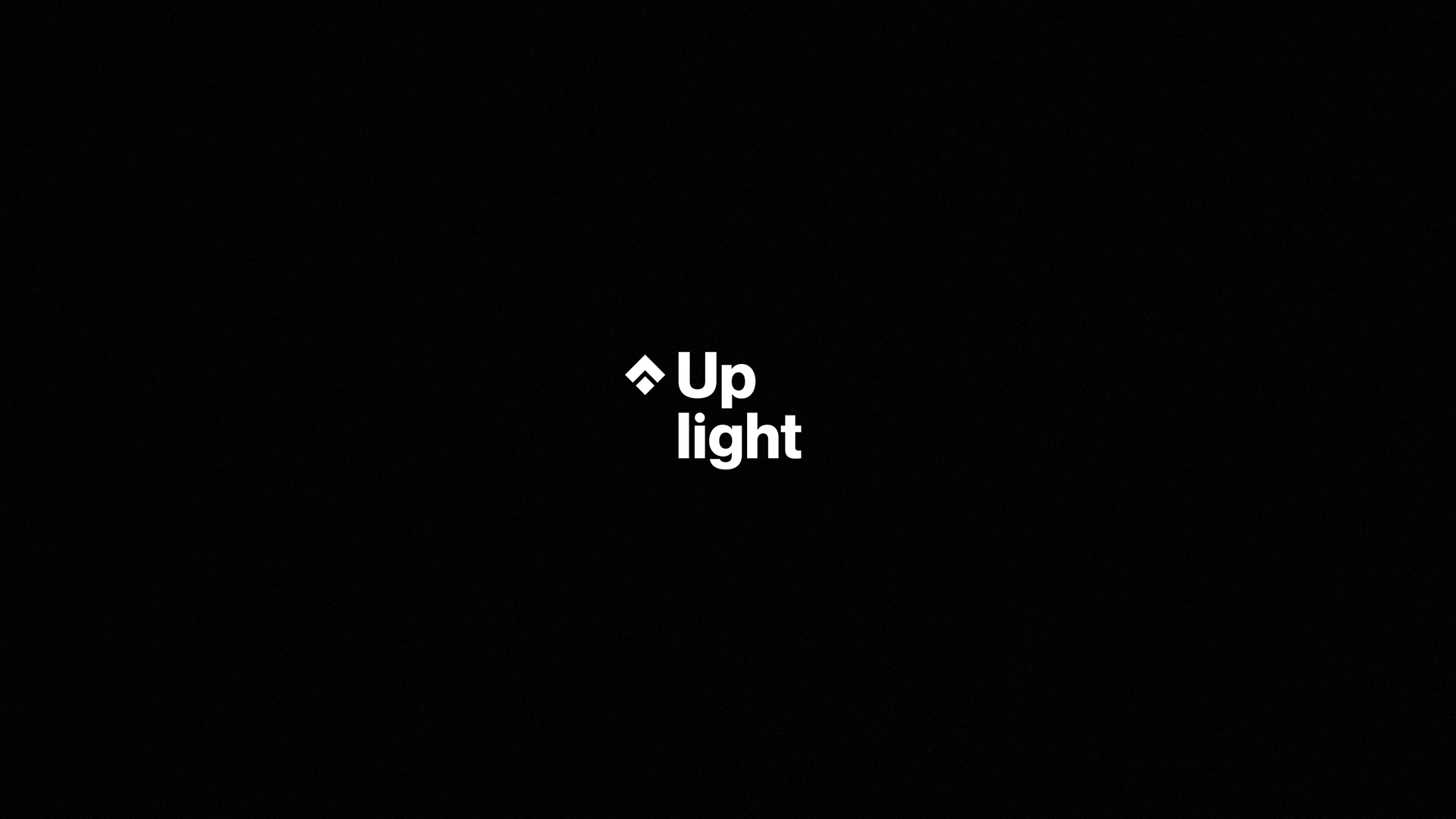
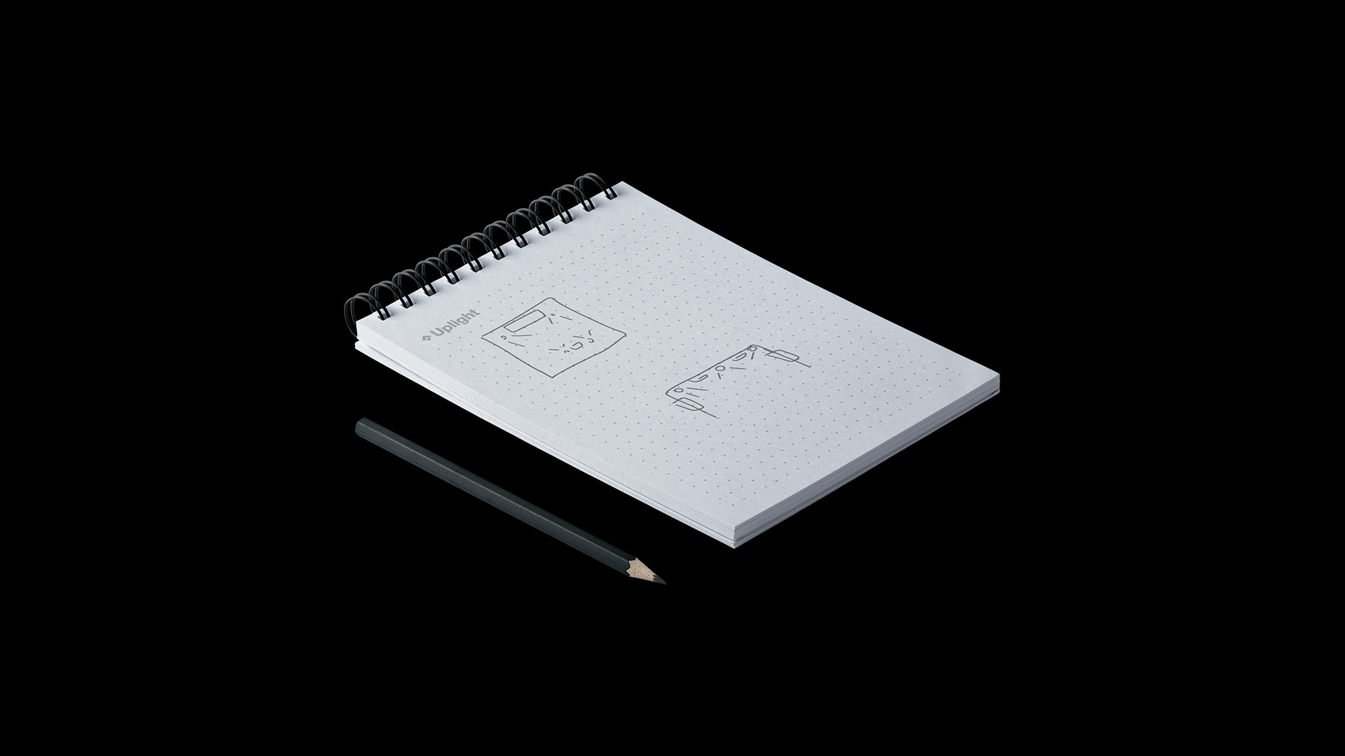
No símbolo, representamos o nome da empresa da forma mais literal e simples possível: com a flecha para cima simbolizando o 'up' e, o losango, 'light'.
-
In the symbol, we represent the company's name in the most literal and simple way possible: with the upward arrow symbolizing 'up' and, the lozenge, 'light'.